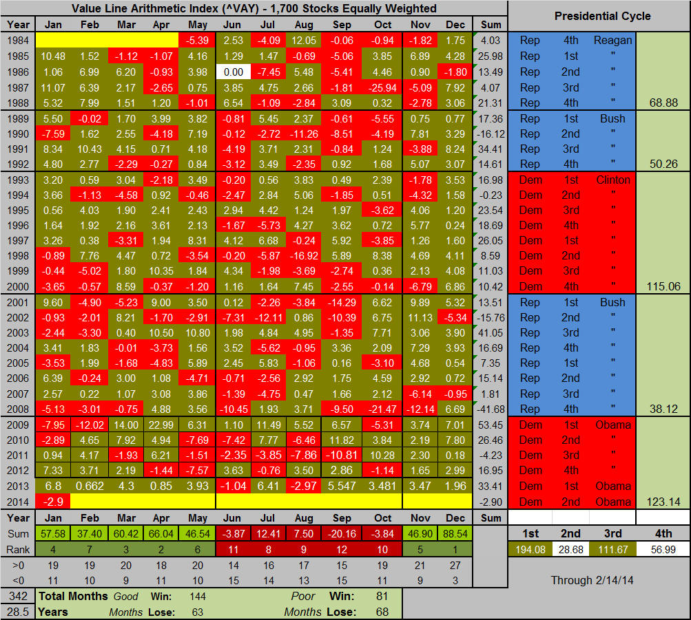
Cycles in the Market There are a few cycles in the market that every trader/investor should be aware of. I've routinely presented the daily patterns (day of month and day of week performance for the S&P) that I've accumulated over the past several years, but there are two other prominent ones (monthly patterns within the year and the four-year Presidential cycle. Before I wow you me with some eye-opening statistics, let me say a word about the Value line Index, our preferred tracking vehicle. 6/05/11 ...The Value Line Index ($VLE or ^VAY for Yahoo Finance) is an average, unweighted index of the 1,700 stocks that Value Line follows. Unlike the S&P500, which is market cap weighted and as such is driven by the largest stocks, or the Dow, which is weighted by a dollar weighting scheme and can be moved by other things beside price change, e.g., stock splits, the Value Line Index gives equal weighting to all 1,700 stocks. And if you think about it for a moment, when you build a portfolio of stocks (even for short-term trades), you probably equally weight them. I might put $50k in stock A and $50k in stock B, for example. Further, we're usually trading mid cap-stocks like AAP instead of mega large caps like WMT. The following table shows how this monthly index has performed over the last 342 months (28.5 years) by month, by year by monthly grouping and by the Presidential cycle. The red boxes highlight months where the index has fallen more than five percent; the green boxes highlight months where the index has risen by more than five percent. Monthly, December has had 27 of 30 positive returns with a cumulative total of +88.5 percent to make it by far the best month of the year. Contrastingly, September and October have been the worst performing months. If you accumulate the seven consecutive months starting November 1st through May 31, there were 144 winning months to 63 losing months (we'll call this the good half of the year even if it is seven months). The other five months had 81 winners to 68 losers (the bad half of the year). More on this in a minute. So far as the Presidential cycle is concerned, the 1st and 3rd year of a Presidency have been the best for the market--the 1st a little better because of the performance in Obama's first year.
This next chart shows how these monthly returns were distributed.
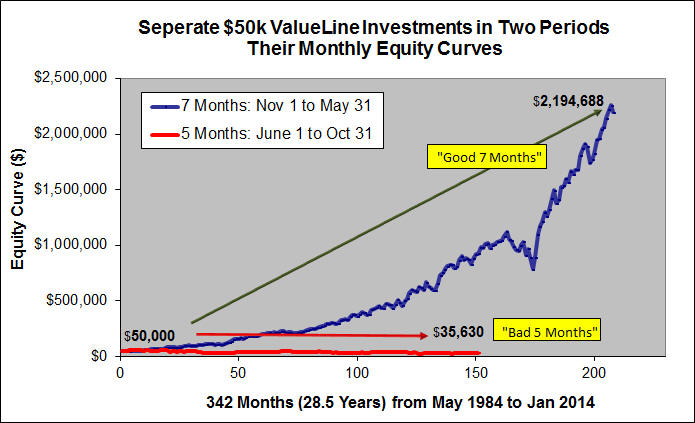
Here's the eye opening chart that I promised. Assume
that you had $100,000 on May 1st of 1984, and you had this strategy in mind:
from June 1st through October 31st of each year you would invest $50,000 along
with the gains that it earned in the Value Line Index--assuming you could;
and from November 1st through May 31st of each each year, you invest the other
$50,000 and its earnings. The following chart shows how these two accounts
would have done over the 342 months. Note, the line segments are of different
length because one is tracking seven months, while the other tracks five.
At the end of this period, the funds invested in the good half of the year would
have grown to $2,194,688, those invested in the bad half of the year would have
fallen to $35,630. It pays to know where we're at in the cycle and adjust
our trading strategies accordingly.
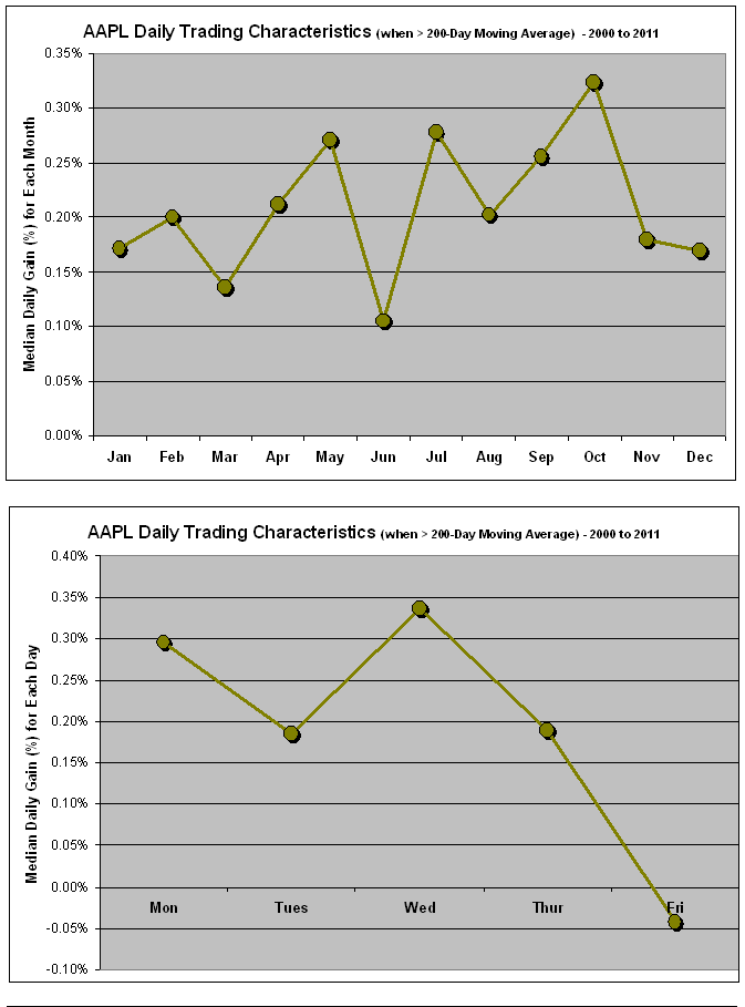
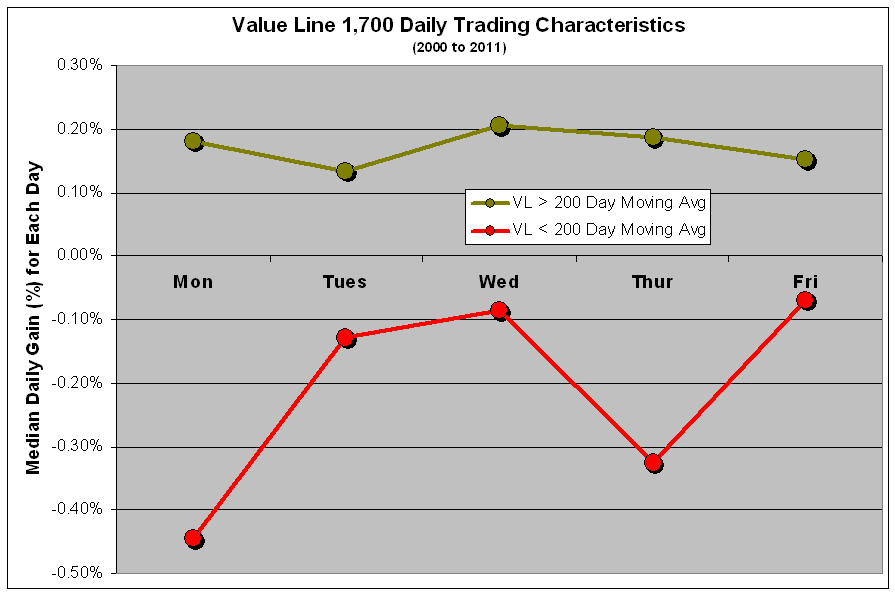
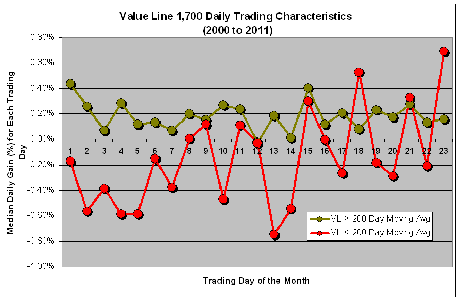
Market Edges ... Market cycles (month of year, day-of-week, trading day of month and year in the Presidential cycle), present edges in the market, especially if you take the 200 day moving average into consideration. This first chart tracks the arithmetic average of Value Line's 1,700 (blue) and its 200-day moving average (red). Clearly, we're well below that average now.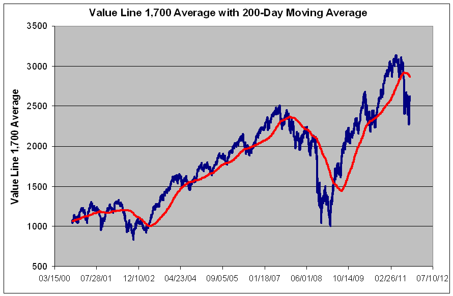 This chart tracks the median daily return in the VL 1700 as a function of month. When the market was above the 200-day moving average, September was the highest performing month; whereas, when we're below that average, April, May, Nov and Dec provided the best edges over this time frame September has been particularly brutal. 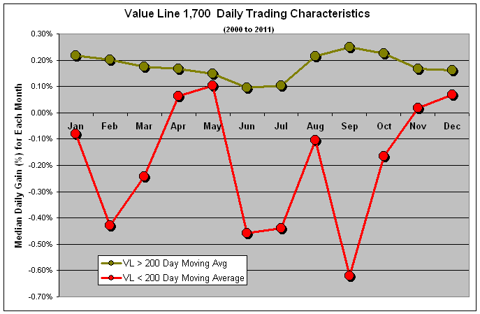
 This chart tracks the median daily performance by year in the Presidential cycle. When the market is trading above its 200, the 3rd year in the cycle offers the best edge, but when the market is under, as it is now, its the first year in the cycle. 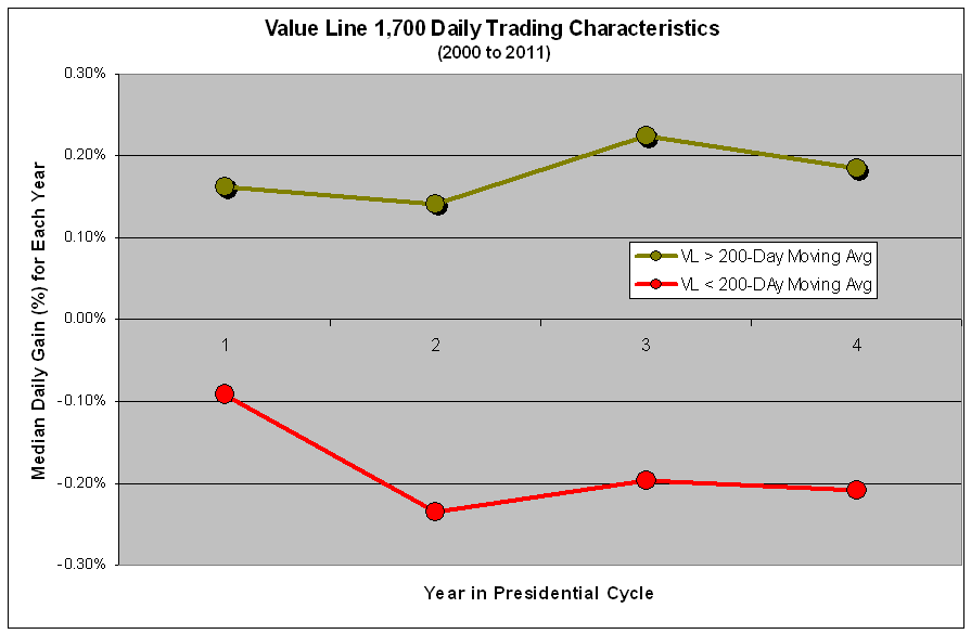
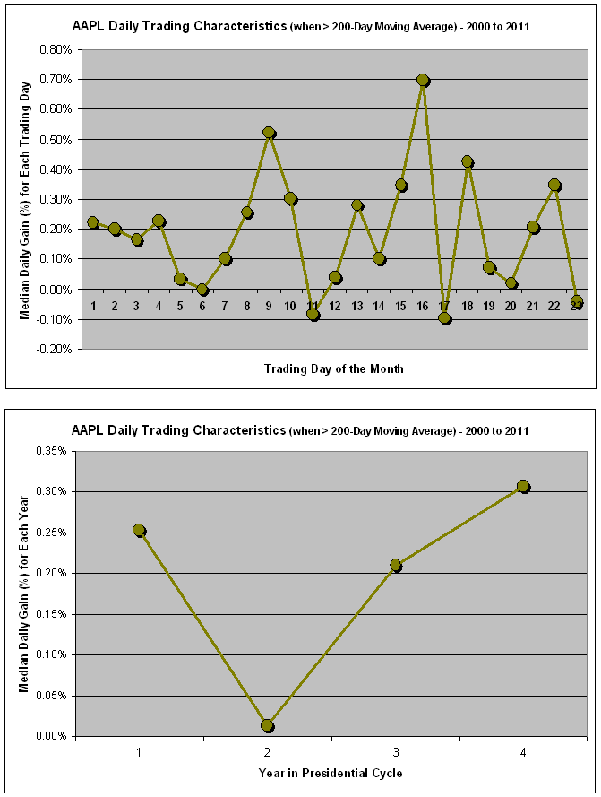
This next set of charts shows tracks the median trading edge for Apple Computers from 2000 to 2011. It's best month has been October; best day has been Monday and Wednesday but watch out for Friday. The middle of the month and the fourth year of the Presidential cycle have provided the best edge.
 | |||||||||