TripleScreenMethod.com
The Amazing 200: Another Thought About Market Strength
Richard
W. Miller, Ph.D.
Published December '05 Issue of CANSLIM.net
In the 11/04/05 issue of TSM Daily Report, I shared results from a study I continue to make on market strength. I pointed out that most traders spend the majority of their time identifying the next great stock to trade and are far less concerned about the strength of the market. Even though the market in general and specific sectors in particular account for as much as 75% of any stock’s price movement. Clearly, time spent evaluating market and sector strengths is time well spent.
For the past year and a half, I’ve collected data for a new measure of market strength I’ll call the “amazing 200,” amazing because of the portrait it paints of the shape of the market. First, I count the number of stocks priced above $10 that have averaged 100,000 shares traded over the past 20 days and end the day trading below their respective 200-day moving averages (N200dMA). As the S&P rises (and the S&P accounts for more than 80 percent of the total market’s capitalization), N200dMA falls, reflecting the broad strength of the rise. Conversely, a falling market exhibits the reverse behavior, i.e., the N200dMA rises, reflecting the weakness. The market and N200dMA move inversely to one another.
Chart I highlights consecutive runs for the S&P: a 67.2 point fall between 8/4/05 and 10/20/05 followed by a 87.8 point rise to 11/23/05. N200dMA runs higher. Notice its general inverse relation. The smooth line traces N200dMA’s 10-day moving average, which I’ll call 10dMA. When the S&P falls, N200dMA rises, and its 10dMA generally falls under N200dMA, i.e., the actual number of liquid stocks trading below their respective 200-day moving averages is more than its 10-day moving average would estimate. The inverse is true too: a rising S&P results in a falling N200dMA and its 10dMA predicting more stocks trading below their respective 200-day moving average than observed. The amazing 200 measure of market strength--I call SumDiff--is the running sum of the difference between N200dMA and its 10DMA.
Chart II shows how SumDiff varied over the past year and a half. Down arrows mark transitions where the market strength begins to improve (SumDiff begins to fall) and up arrows transitions where the market strength begins to deteriorate (SumDiff begins to rise). SumDiff clearly moves inversely to the market, but what’s not so clear is their relationship change over the period shown

Chart III, a direct plot of SumDiff against the S&P, shows how this relation changed between the arrows in chart II. The arrow shows where we’re on 11/29/05. The blue symbols (lower line) were produced in the first segment when the market was moving up and the day-to-day change in SumDiff grew more negative, i.e., moved from right to left on the chart over a 147 days. That period was then followed by one where the market fell, red symbols, over the next 120 days. Over the period, the blue, yellow and green symbols (alternate lines) mark up periods in the market, are parallel, and move right to left. The red and light blue symbols mark down periods and move left to right. Notice, both sets of parallel lines have different slopes, i.e., the falling periods in the market drew a flatter response, less change in S&P, from the change in SumDiff. Note too, the overall trend has been bullish for this period.
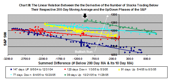
So how does one use this information? Monitor SumDiff and watch for transitional peaks to form in chart II, as last we had in late October. Once the peak forms, monitor the length of the run on chart III. Today, we’re 39 days into its current down turn, indicating a continued strengthening market, probably one which has much further to run.