TripleScreenMethod.com
Measures of Market Health: Number of Stocks Trading Below Their Respective 200 Day Moving Average
Richard
W. Miller, Ph.D.
Published November '05 Issue of CANSLIM.net
Traders & investors spend most of their time identifying the next great stock to trade. Most don’t realize that the market in general and specific sectors in particular are estimated to account for as much as 75% of any stock’s price movement. In times of poor market health, in periods of rising interest rates, the price of even fundamentally sound stocks fall with the market, or as bad, their sectors rotate from favor as the various stages of the business cycle evolve. For example, the housing sector has recently rotated from favor with climbing interest rates.Various measures are used to estimate market strength. Richard Arms’ Trading Index (TRIN), for instance, contrasts a market’s relative volume of declining and advancing issues (say for the NYSE or Nasdaq). That is,
TRIN = (Volume Declining / # Declining) / (Volume Advancing / # Advancing)
A TRIN below one is bullish, because the weighted volume of advancing issues exceeds that of declining ones. In a bullish market more issues advance on greater volume. Extreme values of the TRIN provide oversold/overbought signals.
The number of issues making 52-week highs and lows provides another measure of market strength or, more specifically, the breadth of its performance. A further measure, the percentage of NYSE stocks giving bullish point & figure signals, allows one to assess that market’s propensity to reverse, i.e., percentages above 70% are extremely overbought and ready to turn down, while percentages below 30% are extremely oversold and ready to rebound.
I’ve been collecting data over the past year and a half for another measure of market health, i.e., daily, the number of stocks priced more than $10 and averaging 100,000 shares traded over the last 20 days that end the day trading below their respective 200-day moving averages (N200dMA). In a health, rising market, N200dMA falls, while it rises in a falling market. Unlike those measures described above, the N200dMA bears a linear relationship to the daily change in market value, i.e., it’s not strictly an oversold/overbought indicator.
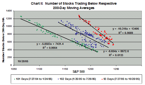
Consider the weekly chart below and the three time periods covering the last 456 days of S&P 500 trading. The green highlighted period trends up; the blue is range bound, first falling, then trending up; and most recently, the trend is down.
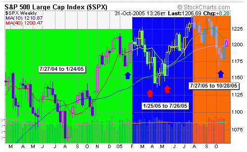
Notice, an 1175 S&P occurred in all three regions (four arrows). The question: Is the market equivalent at those points? The following chart addresses that question.
The S&P behavior in the three regions is quite different as is evident in the three relationships between the S&P and the N200dMA. The relation remained linear; however, the slope increased as the S&P aged. That is, when the S&P fell to 1175 most recently, the N200dMA was 1285 (red). At the other extreme, when the market rose during the first period (green), a 1175 S&P value was accompanied by 548 stocks trading below their respective 200-day moving averages. During the blue period, the 1175 S&P had 854 stocks trading below their respective 200-day moving averages. Clearly, market health was very different for these three periods. In fact, the most recent arrow in the first chart is far less healthy than the other three.
A further derivation, the difference between the number of stocks trading below their respective 200-day moving averages and the 10-day moving average of that number bears a linear relation with the S&P, more specifically, the daily difference in the two. One would intuitively expect: (1) a smaller number of stocks trading below their respective 200-day moving averages to be bullish; (2) a negative difference between that number and its 10-day moving average to be bullish (N200dMA is falling); and (3) a negative daily difference (difference is becoming more negative) to also be bullish. For example, a –150 daily change in the difference between N200dMA and its 10-day moving average would be accompanied by a +21 point day for the S&P.
Clearly, time spent evaluating market and sector strengths can be time well spent.