TripleScreenMethod.com
Market Health and the “Amazing 200” Revisited
from www.CANSLIM.net (published November 2006)
Richard W. Miller, Ph.D.
Earlier in the year, I presented here a market health measure, called the “amazing 200,” that I use (and update daily) to monitor market health, i.e., its bullish or bearish intermediate trends. Coupled with important market cycles (six month and Presidential) and the quad sector analysis described last month, this measure paints a market environment as rich for longs or shorts in the same way a card counter playing 21 might paint a deck as rich in face cards or not.Traders spend their time identifying the next stock to trade, though the market in general and specific sectors in particular account for as much as 80% of an average stock’s price movement. An accurate forecast of the market’s directional tendencies helps a trader plan his directional approach. Most would agree, I’m sure, that a metric designed to follow what the breadth of the market is doing, and more importantly, is likely to continue doing, is probably worth watching. The “amazing 200” is such a metric.
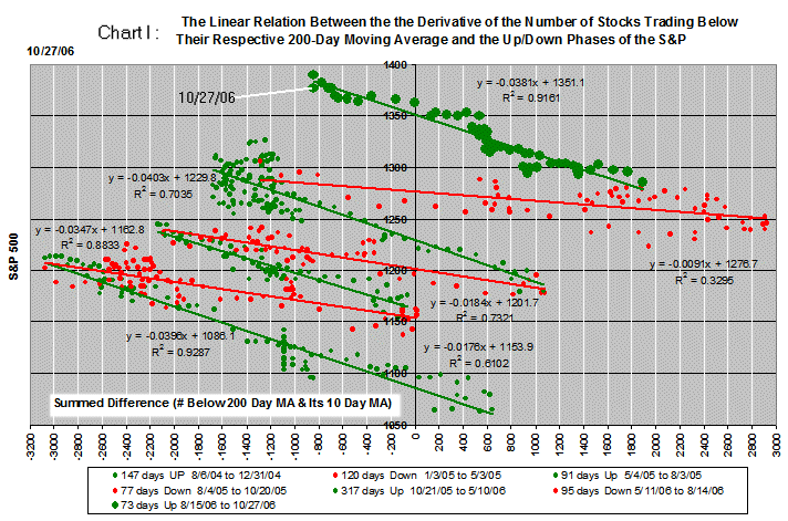
It counts the number of stocks priced above $10, averaging 100,000 shares traded daily, that end the day trading below their respective 200-day moving averages (about 2,800 stocks). The “amazing 200” sums the difference between this metric and its 10-day moving average over time, much like On Balance Volume does. As the market rises, the number of stocks trading below their 200 falls, reflecting the broad strength of that rise, and the “amazing 200” grows more negative. Conversely, a falling market exhibits weakness over its breadth and a growing positive move for the “amazing 200.”
Chart I depicts this metric over the last 812 days through four bullish (green) and three bearish (red) periods. Each point charts its daily measure. Bullish runs angle up from right to left, while the bearish ones angle down from left to right. Interestingly, the average bullish slope, -0.038, is more than twice that of the average bearish slope, -0.015, as the larger trend over the last three years has been positive. Note, the bullish slope is really positive, just depicted negative here to be placed on the same chart with bearish periods.
Clearly, each of these seven runs lasted months: from a bearish 77 days in August through October of 2005 to the bullish 317 days that followed. While it’s not possible to catch the exact turns in the market, catching the middle 50 percent of a move is not difficult. When a green period identifies itself, the wind is at the back of your longs. That identification gives you confidence to trade more shares long and fewer short. On the other hand, after a green run has lasted several months, one begins to look for its bearish turn. We’re in the 73rd day of the current bullish run and at a point where the market could well turn red.
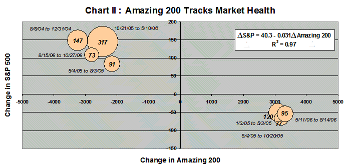
Chart II draws an inverse relationship between the size of the change in the S&P and the size of the change in the “amazing 200.” The number in each bubble and its size reflect the number of days that run lasted. Plainly, the “amazing 200” has reflected performance over the breadth of the market, and the shape of its daily change (Chart I) has painted a picture of the market’s health. Both should be of interest to both investors and traders alike.