TripleScreenMethod.com
Three-Year Trends in Sector Rotation
from www.CANSLIM.net (published August 2006)
Richard W. Miller, Ph.D.
I’ve said here several times that as much as three-quarters of any stock’s price movement results from a combination of market conditions and specific sector strengths Obviously, any strategy used to pick stocks—especially in this market—should involve an analysis of sector performance. That’s what I want to talk about today.In the August 2005 issue of Canslim.net News, I provided an initial assessment of month-to-month sector rotations. I followed that with an update on my further research in the January 2006 issue. I’ve now finished over two years of data collection and want to provide further insight into the market rotation cycles of 31 market sectors (806 month-to-month rotations in 2004, 1,612 in 2005 and 806 in 2006). It’s these macro rotation cycles that drive the market from one group of stocks to another, regardless of company fundamentals. This year, the Energy Sector has rotated into favor, pulled back, then rotated into favor again. Now, it’s behaving differently.
As I discussed earlier, my approach uses Markov Chain Analysis (MCA). One starts by defining the states of the system under study, and I’ve defined four (called quads) based on sector returns over the combination of their past one- and three-month performances: “I” (both returns negative), “II” (1 month positive, 3 month negative [breaking out]), “III” (both returns positive), and “IV” (1 month negative, 3 months positive [pulling back]). MCA enables me to assess transition probabilities among the four states on a month-to-month basis. The resultant probability matrix can then be used to answer questions pertinent to the trader: Is it more profitable—have a higher probability of success—to buy good stocks in poorly performing sectors (quad “I”) or good stocks in the best performing sectors (quad “III”)? If my stock is in the Energy Sector and today that sector lies in quad “II” (performed well over the past month), where’s the most likely quad to find it in next month?
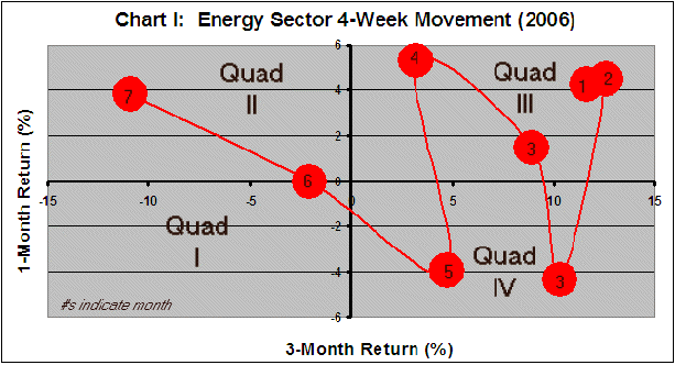
Chart I shows the 2006 month-to-month rotation cycle for the Energy Sector. Red circles identify monthly performance rotations over the past month, e.g., the encircled 4 represents April 2006 1- and 3-month performances.. Notice, energy has spent most of 2006 in quad “III,” i.e., producing a positive performance over both the last month and the last three months. When it’s pulled back, i.e., fallen into quad “IV,” it was buyable earlier in the year, i.e., it continued its multi-month bullish run again into quad “III.” At the end of the year, energy finds itself in quad “II,” and the natural question becomes: Where now?
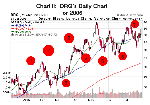
Chart II shows how DRQ, an Energy Sector member, changed over the year. The encircled points correspond to those in Chart I.
All well and good, but how does one use this information? The question of most interest concerns the probabilities with which these sectors rotate among quadrants. That is, if I’m interested in a sector currently in quadrant “II”, what are the chances that it will continue to do well and find itself in quadrant “III” next month? Or, on the other hand, fall into a more negative quadrant “I”? Too, do sector rotation probabilities change over time as market health and the business cycle evolve?
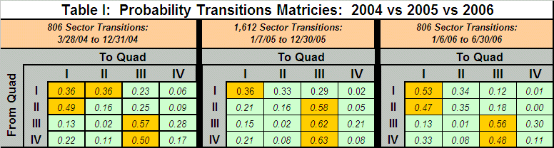
The table addresses the second question, showing probabilities for transitions from one quad to another over the last three years. For example, in 2004 there was a 0.36 probability that a sector in quad “I” would find itself there in the next month (0.36 probability in 2005 and 0.53 in 2006).
The gold areas highlight the most favorable transitions. A sector finding itself in quad “II” (positive performance over the last month but negative over the last three months) might continue its positive performance and remain in quad “II” or move over into quad “III.” In 2004, there was only a 0.41 probability of that happening, but in 2005, that rotation became much more likely (0.74 probability), though this year it’s less so (0.53 probability). A consistent rotation over the years has been quad “III,” remaining in quad “III,” and quad “IV” moving back into quad “III.” Month 3 in Chart I, for example, shows this rotation cycle for the Energy Sector. It’s a behavior typical for a strong performing sector consolidating itself in a pullback then resuming its bullish run.
Two qualifications to bear in mind: (1) this analysis assumes no difference in the behavior of individual sectors, i.e., all are equally likely to make the same type transitions; (2) a few of the transitions are difficult—though not impossible-- e.g., the quad “I” to quad “III” transition, i.e., from a state where both one and three month performances are negative transitioning to one where just the three months performance is negative. The above matrices are best used to find new opportunities and to assess holdings and their likelihood for change. Presently, the best sector-related opportunities come from pullbacks into quad “IV” entries into quad “III.” Energy has entered uncharted waters for the year. According to our probabilities, it’s likely to fall into quad “I” from here.