TripleScreenMethod.com
Two Measures of Market Health
by Richard W. Miller, Ph.D.
appeared in May Issue of CANSLIM.net NewsIt’s estimated that 70 percent of a stock’s price movement is due to a combination of general market trend and its sector/industry strength, and only 30 percent to individual company characteristics. So it behooves us to monitor closely both market health and sector/industry strength. Unfortunately, the average investor doesn’t, opting instead to spend the majority of his or her time identifying the next stock to trade. This month, I want to discuss two methods for assessing market health: the NYSE bullish percent and the number of stocks trading below their respective 200-day moving averages.
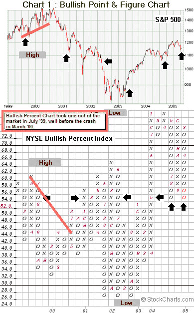
To understand the NYSE bullish percent, one first must understand a method of charting, which Charles Dow, himself, used in the early 1800s. The method, “Point & Figure” charting (P&F), follows the daily price movement of a given stock or index through a series of columns of alternating Xs and Os: Xs for movement up signifying demand exceeds supply and Os for movement down signifying the opposite.
The P&F method’s strength lies in its unique ability to categorize a stock’s pattern unambiguously as either bullish or bearish. A change of columns requires six percent of the component stocks to change signal, and the numbers and letters within the columns signify months, the latter months requiring two digits, e.g., A for Oct.
The percentage of NYSE stocks providing a bullish P&F signal historically has proven an accurate measure of market strength, i.e. showing highs were unsupported at major turns in the market, e.g., the ’87 crash. The bottom of Chart 1 shows the bullish percentage of NYSE stocks over the last six plus years plotted in its own P&F format. It indicates the beginnings of a bullish market—one to be entered long--when the columns switch from Os to Xs, and more stocks are becoming bullish (breaking out). Conversely, the beginnings of a bearish market—one to be entered short, played carefully, or stayed out all together—is indicated when columns switch from Xs to Os, and more stocks are becoming bearish (making new lows). The lower the bullish percent when the market switches from Os to Xs, the more powerful the coming bullish move to be expected, and conversely, the higher the bullish percent when the market changes from Xs to Os, the more powerful the bearish move to be expected.
The arrows on the S&P index chart identify points in time when the NYSE bullish percentage was ~54 percent, as it is now: in 1999 the index was climbing to its all time high and in 2003 rebounding from a major low. The most recent two arrows show equivalence in the number of bullish stocks though the index itself shows a higher high, a bearish divergence signifying lower prices from here. Note too the weakness in the index’s climb to a high in 2000 was marked by a lower bullish percent (June 2000 index made higher high while bullish percent made lower low: 66 percent to 44 percent--a bearish divergence). Fewer companies supported the 2000 high, while the new low in 2003 was confirmed by a low in the number of bullish stocks. In late 2004, ~78 percent of NYSE stocks gave bullish P&F patterns as companies rebounded from their 2003 low, much higher than the ~60 percent seen in the higher high of 1999 (developed from a more mature bullish market). Rarely has the market remained so overbought as to have 70 percent or more of its companies giving bullish signals.
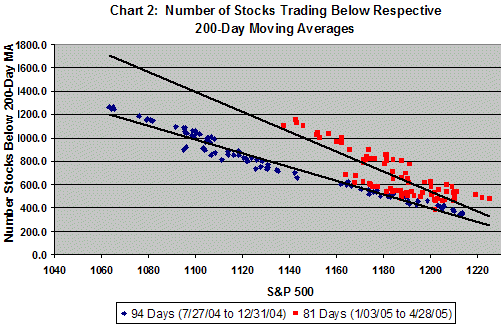
Chart 2 plots the relationship between the number of stocks trading below their respective 200-day moving averages and the level of the S&P (between 7/27/04 and 4/28/05 for ~2,500 stocks with price >$10 and trading >100k shares daily). During the latter half of 2004, a tight, linear relation existed regardless of whether the S&P was climbing or pulling back (lower line). More recently, lower levels in the S&P have been supported by significantly more stocks trading below their respective 200s. Again, we’re likely going lower from here as the breadth of the market weakens.
Find a more recent discussion of this market health factor here.