TripleScreenMethod.com
Trends in Sector Rotation, a Markov Chain Analysis
Richard
W. Miller, Ph.D.
Published April '05 Issue of CANSLIM.net
Three-quarters of any stock’s price movement results from a combination of market conditions and sector strength. Yet most investors spend the majority of the time they allot for finding their next investment to picking stocks, not in understanding sector rotation cycles. We’ve all heard that picking the best stock in the worst sector is akin to swimming upstream against a current. Is that true or does it allow one a low-risk opportunity?This month, I show how two sectors have rotated into and out of favor over the past 12 months, largely in opposition to one another, then introduce a statistical technique, Markov Analysis, that let’s one assess the probabilities for these inter-quad transitions. This, by the way, is the same technique that baseball managers use to calculate probabilities that a runner might score from first with no outs and the hitter bunting.
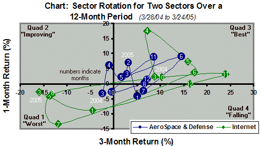
The chart plots monthly the returns produced by two sectors over 1- and 3-month periods during the past 12 months. It divides the space into four quadrants: 1 (both returns negative), 2 (1 month positive, 3 month negative), 3 (both returns positive), and 4 (1 month negative, 3 months positive). Numbers represent months, and lines track sector movement. For example, the internet sector started in quadrant 3, spent the 4th, 5th and 6th month there, then fell into quadrant 1. The question of most interest concerns the probabilities with which 31 such sectors transitioned among these quadrants over the past 12 months. Specifically, were returns better when one bought a fundamentally sound stock in a sector currently in quadrant 1 (poorest performing) or one in quadrant 3 (best performing). Remember, conventional thinking says buy the best stock in the best sector.
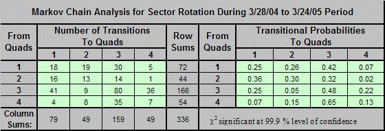
The Markov Chain approach starts by counting the quad-to-quad transitions among the 31 sectors over the last 12 months (336 in all) then uses a contingency-table approach to assign probabilities. For example, there were 30 transitions from quad 1 to quad 3 and 18 transitions where a particular sector remained in state 1. These counts translate to probabilities of 0.42 and 0.25, respectively. That is, over the last 12 months of ups and downs in the market, a sector in quad 1 based on its 1- and 3-month performance would stay there over the next month 25 times in a 100; it would move into top-performing quad 3 a more likely 42 times in a 100.
If a sector were in quad 3, the best-performing sector, there was a 0.48 probability that it would remain there over the next month, a 0.22 probability that it would begin to under perform and fall into quad 4, and a 0.25 probability that it would really under perform on a larger scale and fall into quad 1 (nearly a 50-50 chance of continued good or a reversal to poorer performance). On the other hand, if a sector were in quad 1, the worst-performing sector, there was a 0.25 probability that it would stay there over the next month but a 0.68 probability that it would begin to perform and climb into either quad 2 or 3. Last year, it paid to buy the most fundamentally sound stock in the worst performing sector, i.e., the worst performing quadrant. I’ll continue to collect data, but I suspect this finding is a fundamental truth in sector-rotation cycles.