TripleScreenMethod.com
Exploring SP-500 Chart Patterns with Markov Chain Analysis
Richard
W. Miller, Ph.D.
Over the last few months, we've looked at chart patterns that provide high-probability entry points, e.g., 21-day lows, gap openings and "hammer" candlesticks. Today, I want to introduce Markov chain analysis, a method that can be used to assess significance of movement between various chart patterns. In particular, I will answer questions like: What is the probability that the S&P will be up this week if it finished higher last week on increasing volume?
Markov chain analysis can be used to assess pattern transitions over time. It's a method designed to study processes that exhibit some dependence on prior events but still have some degree of randomness. Though the statistical approach is straight forward, my goal here is not to teach you how to perform the statistical analysis but to provide tabulated results that might prove useful in assessing where the market is likely to go next week given its behavior this week. So what are we talking about?
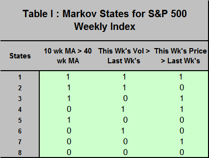
Consider eight states that the S&P-500 weekly index might find itself in at any point in time (defined in Table I below): State 1, for example, has its 10-week moving average greater than its 40-week moving average (a bullish environment), has this week's volume greater than last week's and has this week's price greater than last week's, while State 8 meets none of those criteria. The accompanying weekly chart shows how these states transitioned among themselves over a three-month period last year. Using a Markov approach, one assess the likelihood, for instance, that next week the index will be up given this week the index was up on increasing volume in a bullish environment (10-week moving average greater than 40-week moving average).
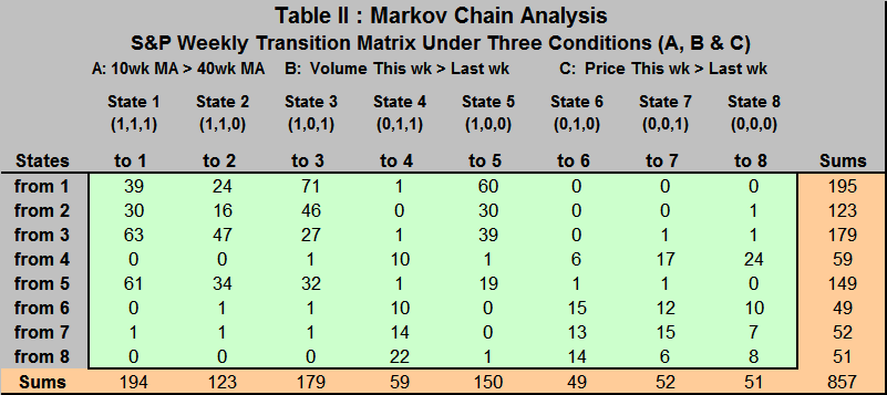
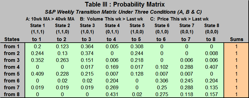
For this analysis, 858 weeks (Oct '88 to Mar '05) of the S&P were classified by their state as defined by the three criteria. Then their week-to-week transitions were counted (enumerated in the Markov Chain Analysis Table II). For example, there were 60 transitions from State 1 to State 5 and 857 total transitions. The second table converts these numbers to probabilities (each number is divided by its row sum). For the statisticians in the group, the chi-square sum is186.9 for the matrix; much greater than the 66.34 needed at the 5 percent level of significance with 49 degrees of freedom. Cells shown in yellow are significantly greater than would be expected for random transitions. So how can we use this information?
Assume the market is bullish, i.e., the S&P's 10-week moving average is greater than its 40-week moving average--a "golden cross" has occurred. If this week, the market was in State 1 (higher volume and greater index than last week), there is a 0.564 probability (0.20 + 0.364) that the index will be up next week. On the other hand, if this week the market was in State 5 (lower volume and lower index than last week), there is a 0.624 probability (0.409 + 0.215) that the index will be up next week. If the market was in a down period--say in State 8 (0,0,0) this week--there would be a 0.157 probability that it remains in State 8 versus a 0.549 probability that the index increases (the chart shows three consecutive State 8 conditions--a low probability event). After 4 days this week, the index remains in State 5 (1,0,0), where it was the week before, so statistically there is a better than even chance that the index will be up next week. Over the coming weeks, I'll introduce other patterns and their associated sets of probabilities, all with the intention of finding either profitable patterns of entry or accurate market forecasting tools.