TripleScreenMethod.com
Sector Relationships
Richard W. Miller, Ph.D.
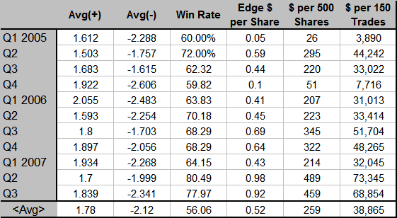
The way to succeed in the equity trading business is to control risk. When stops are hit, honor them, even though the TSM stocks have a good chance of coming back from below the stop price. The difference between a profitable trader and one that continues to lose is that the former controls risk, never, ever, ever failing to honor a stop. Over the last three years, the TSM method has achieved an average +$0.52 per share edge, i.e., it's averaged +$0.52 per share profit for all trades made: @ 500 shares per trade and 150 trades per quarter, that's $39,000 per quarter. The edge gained by using the TSM methodology is one way to control risk. The following table shows how this edge has changed quarterly over the past few years.
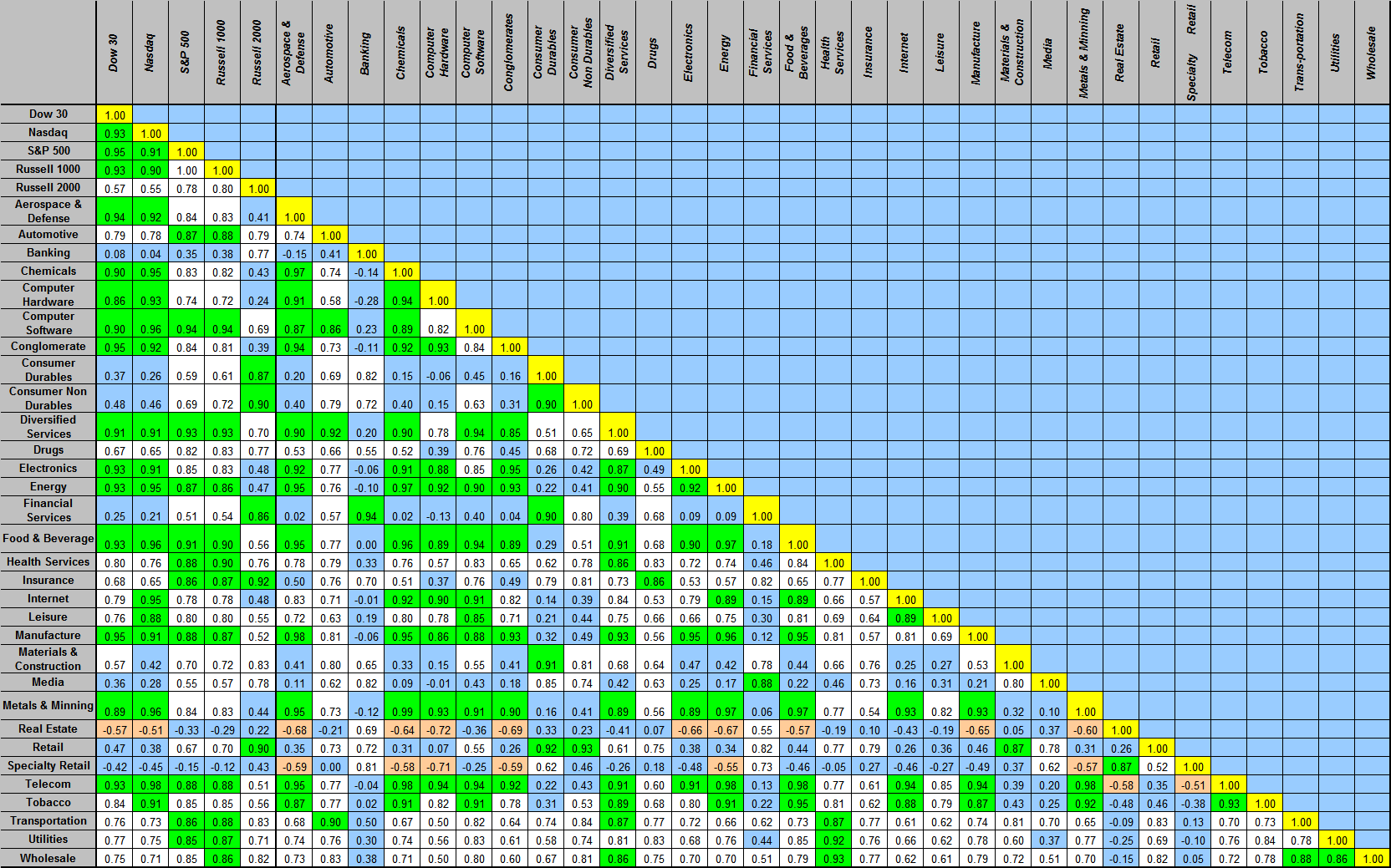
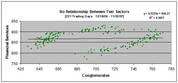
Another risk control measure is minimizing the sector risk, i.e., to trade a basket of stocks from sectors that don't move together. If that sector takes a hit, all stocks within it do as well. Most understand that stocks within a sector move together with that sector, e.g., AAPL and HPQ. Therefore, one wouldn't want to build positions simultaneously in both because the risk would be equivalent to building a double size position in the computer hardware sector. Another type sector risk is one where sectors move directly with one another. In extreme cases, buying stocks in two such sectors would be equivalent to buying them in the same sector (and thus again double one's sector risk). The table below shows the daily correlation matrix for the past 221 trading days (a year's worth of trading). Correlation coefficients are shown for each relationship: they run between extremes -1.0 (perfect inverse correlation) to +1.0 (perfect direct correlation). Direct relationships greater than 0.85 are shown in green; inverse relationships less than -0.5 in red; neutral relationships between -0.5 and +0.5 in blue; direct relationships between +0.5 and +0.85 in white. For example, over the last year, there's been a 0.57 correlation between the Dow and the Russell 2000 (between price movement in companies with large market caps and small market caps), while much better correlations (>0.9) have been seen among the Dow, the Russell 1000, the S&P 500 and the Nasdaq (all dominated by larger market cap companies). Highlighting sectors, the Aerospace & Defense sector's price movement has correlated with that of the Banking sector at a -0.15 correlation coefficient, i.e., slightly inverse.
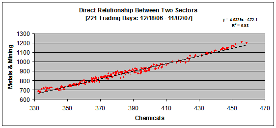
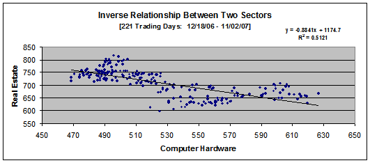
Other examples are shown in the following charts. Note here the correlation coefficients shown in the charts have been squared. The point is this: the Metals& Mining sector has moved, nearly in lock step, with the Chemicals sector so trading stocks in each of these sectors is equivalent to trading multiple stocks within just one of the sectors. The sector risk is worse than one would have trading stocks in sectors that don't move together, like Real Estate and the Computer Hardware sectors. Currently we're holding shares in AIRM (Transportation sector) and CHTT (Drugs sector). Their correlation coefficient is has been 0.77 over the past year.