TripleScreenMethod.com
Industry Sector Preferences in a Rising Interest Rate Environment
(January '05)by Richard W. Miller, Ph.D.
Several important cycles impact the market, and the reasons for most are well understood: the six-month cycle reflects periods where money traditionally enters the market versus the quiescent summer doldrums. From May 1, 1950 through April 30, 2004, if one had invested $10,000 in each of two six-month periods (the bullish November 1 through April 30 and the bearish May 1 through October 31) and segregated each in the Dow for just those six months, the first would have grown to $491,623 (+4,816 percent) while the second would have fallen to $9,684 (-3.2 percent). Every November clearly provides a trader that extra edge when going long.The second cycle of significance is the four-year Presidential cycle. From 1940 through 2004, each pre-election year (2003 being the most recent) has returned an average +18.1 percent for the S&P 500. Further, it has had positive returns in 16 of the 16 cycles. The next-best performer, the election year itself, returned an average +7.5 percent with positive returns in 12 of 17 cycles. Obviously, the party in power does what it can to influence the economy and win the election, then makes the tough decisions for the economy in the first two years of the election cycle. In the election of 2004, the Fed increased the money supply dramatically to boost the economy (and in the process further weakened the dollar).
The third cycle of importance is the decennial cycle where the fifth year of each decade since the 1880s has produced significantly greater returns than other years (averaging +30.8 percent for the Dow). Significantly too, the lows of the fifth year occurred most often in late January. Unlike the other two cycles, though, this one is not well understood. I suspect it results from a confluence of the first two cycles with business cycles that are working their way through the economy.
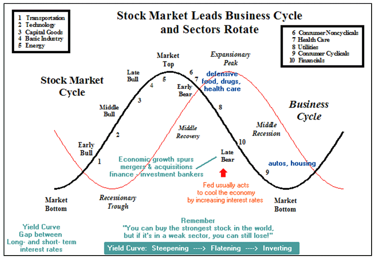
The stock market itself is a leading indicator of such business cycles, i.e., of the cyclic ups and downs in GDP. Unfortunately, the business cycle itself is not exact in its length, in its intensity, or in its degree of sector participation; consequently, it’s usually identified only well after the fact. The accompanying chart shows a typical relationship among the business and market cycles and the business sector involvement. It further shows where the Fed usually starts tightening rates. As the economy begins its recovery, for example, the transportation sector profits from increased business activity, while at the other extreme in a hot economy, the Fed looks to tighten and defensive sectors, like health care and utilities, outperform. Read Perter Navarro’s “If It’s Raining in Brazil, Buy Strarbucks,” for more detail on these relationships. Note: The following chart was developed from his work.
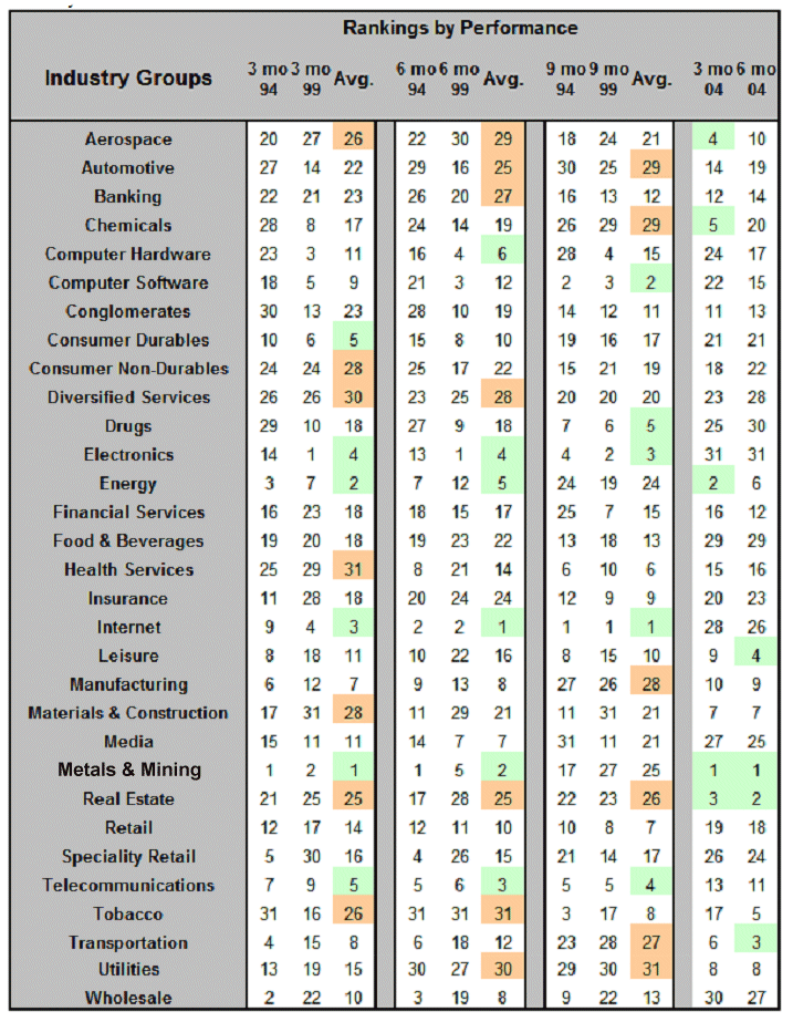
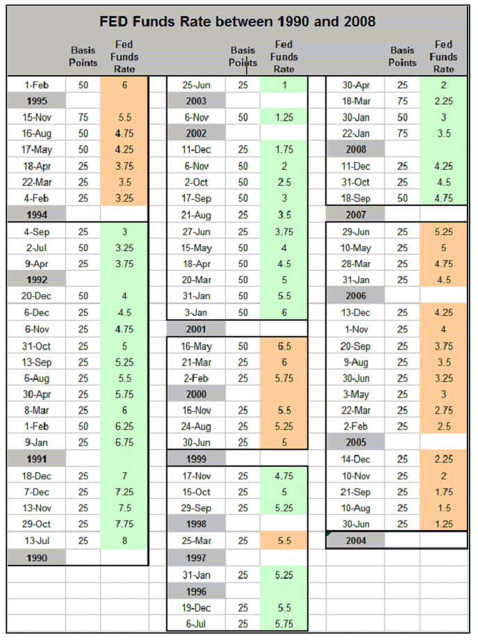
Under the assumption that Fed involvement provides a common marker for the business and market cycles, consider how 31 business groups (members of the 10 larger industry sectors) have performed following the Fed’s first rate increase in one of their tightening cycles. During the last two decades, the Fed has undertaken this cycle of tightening three times: seven increases from a 3.0 to 6.0 percent funds rate over a 12 month period beginning in February 1994; six increases from a 4.75 to 6.5 percent funds rate over a 11 month period beginning in June 1999; and so far, five increases from a 1.0 to 2.25 percent funds rate over a 6 month period beginning in June of 2004. This last tightening finished with 17 increases from 1.0 to 5.25 over a 25 month period between 2004 and 2006 (as I write this on 5/19/08).
The table shows how each of these industry groups performed over these three periods. The 3-, 6-, and 9-month rankings are provided for these tightening cycles (the 9th month for the ’04 cycle will occur in March ’05). The ’94 and ’99 rankings were averaged, then that average ranked, as well. The best (1-6) and worst (25-31) rankings are then highlighted. It’s noticeable that the most recent cycle differs somewhat from the earlier two which are remarkably consistent with one another, e.g., the internet was rapidly growing in the last decade, and it maintained its leadership through the 9 months shown, but in the most recent cycle it performed poorly. Energy, on the other hand, performed well over the first 6 months for all three cycles, but fell off in the 9th month. Real estate is another that performed worse in the earlier cycles when interest rates were not favorable.
This analysis may help predict the group rotation expected over the next few months. Drugs and health care, for example, should improve, but bear in mind that this latest tightening cycle began from a far lower Fed rate. As a result, it may differ from normal business cycle considerations. It pays the investor to be aware of these cyclic changes at play in the market. Note, the following chart showing FED funds rate changes since 1990 was included on 5/17/08.
Sector Rotations: Different Sectors Favored at Different Places in the Business Cycle (050709)
It pays to be aware of the where we're at in the business cycle because one can better anticipate what sector will next be favored. The following chart shows how the market (black line) is forward looking to the business cycle (red line), usually by at least six months.
For example, at a recessionary bottom, businesses have become lean, mean and, frequently, inventory free, the first sector to benefit from new expansion is Transportation as business picks up and products get shipped. Conversely, as the economy turns over from its latest expansionary peak, defensive sectors become favorites (Food, Drugs, Tobacco, Health Care--always needed in any economic environment) and that's followed by Utilities then Financials. The question of most interest to the trader is where are we now.
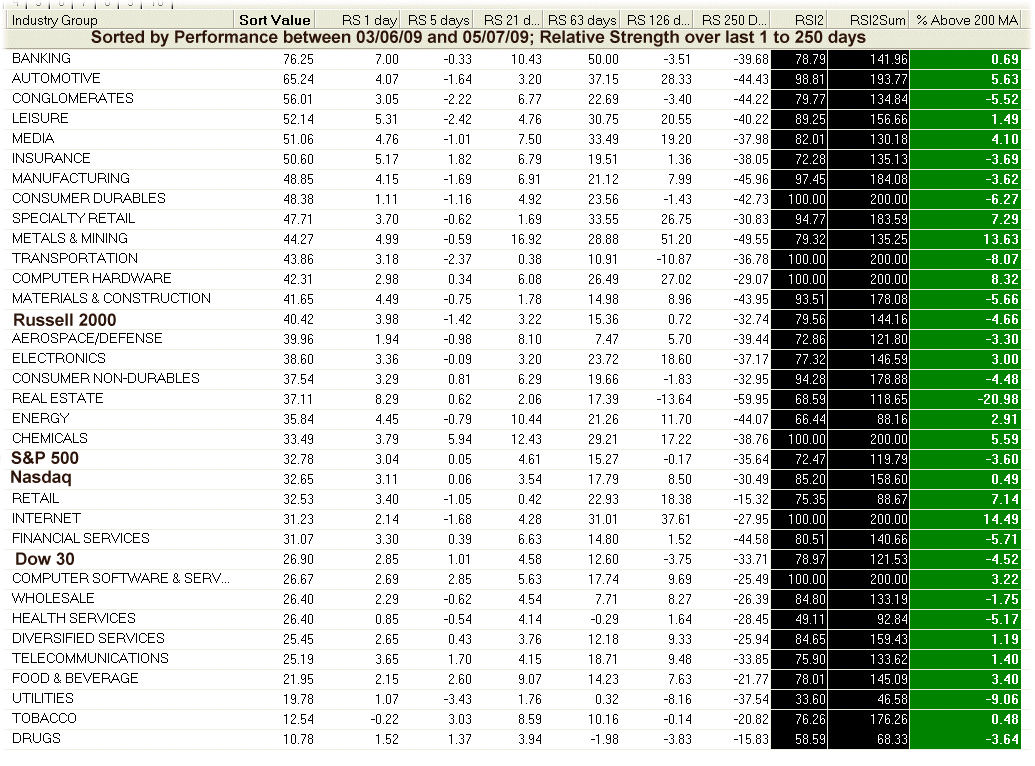
Sector performance from 3/6/09 through 5/07/09 (current bullish run), Banks and Automotives have led the performance (see Sort Value for percent price change), while the defensive sectors have been the poorest performers. So where do we expect to rotate into now? Energy or Transportation? Obviously, as the market continues higher (and the economy bottoms and turns up) Transportation stocks will become favored and Energy further along in the cycle. As yet, none of their stocks are making it through the TSM screens, but watch for them soon.
More recently, over the past month (RS 21 trading days) and past week (RS 5 trading days) the Metals & Mining Sector has been outperforming. LIHR (+11.8 percent over the recent run up) is a TSM stock from that sector. It looks ready to breakout (look at its weekly chart). Too, the Leisure sector has performed well in this bullish run, especially the Restaurant sub-sector with TSM stocks: TAST (+129.5 percent), CMG(+64.0 percent), BJRI(+52.8 percent), YUM(+44.3 percent) and BWLD(+26.5 percent). Since generally a large portion of any stock's move is do to a combination of general market conditions and specific sector favorability, it pays to be aware of these things.
Similarly to the above weekly sector rotations, the following chart shows the daily % change over the past day (R1), past week (R5), past month(R21), past quarter (R63) and past six months(R126). Note, all these periods are trading days, e.g., 21 trading days to the month. Also shown is two-period RSI (RSI2), the cumulative two-period RSI for the last two days (RSI2Sum), and the percentage the index lies above or below its 200-day moving average (%>200d MA). The sectors have been sorted by their one month performance.


