Slide 1
In
this video, the 3rd
in the TSM series, I want to talk about how quality TSM stocks are most
likely to advance over time.
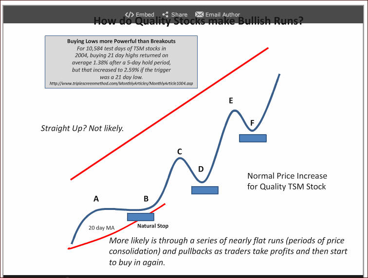
As you might imagine, no matter how good the stock is its price doesn’t just
go straight up like the red line.
The reason: at some point, those that own the stock begin to worry about its
rise and then begin taking profits, and as soon as they do, price begins to
fall or tread water just moving sideways. The real world is more like the
blue line for a quality, TSM stock.
From A to B, price has moved sideways towards its rising 20-day moving
average, as price consolidates after its recent gain. As the two come
together, the stock regains its bullish run to point C where stock owners
then begin to take profits and that selling pressure causes the price to
drop to D where the process begins over again, tracing out the E and F
pullback.
Over time, price makes a series of higher highs and higher valleys with
their turn points often supported by past highs and lows (not shown here),
by major moving averages (20, 50 or 200), by the common Fibonacci ratios
(something we’ll talk more about). Buyers are looking for opportunities to
enter the stock, and these are well known entry points.
If you want to hold the stock over time, each new valley or sideways
consolidation presents a natural place for stop placement, as shown by the
blue boxes, which rises as new valleys are traced out.
Statistical studies, mine as well as others, show that one will have greater
profit opportunities buying stocks in pullback rather than buying stocks at
their breakout, and that’s the basis for the TripleScreenMethod’s technical
approach.
For example, in a study that I did in 2004 tracking 36 TSM stocks over a
total of 10,584 trading days, buying a 21 day low returned 2.59% after 5
days, while buying a 21 day high returned only 1.38% - both profitable but
the pullback significantly more so.
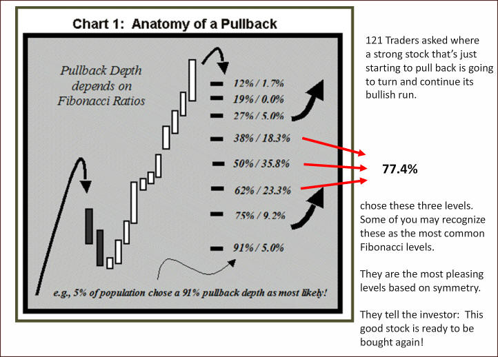
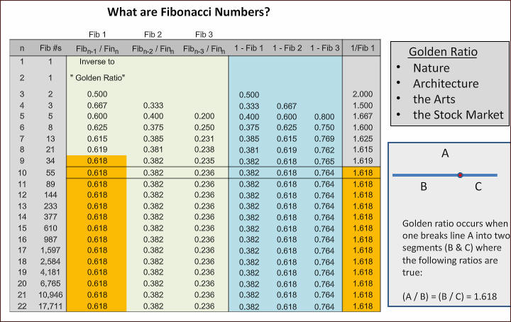
Fibonacci
numbers are a special, but simple, sequence of numbers. The first 22 are
shown in column 2. The sequence starts with two ones then from there each
new number in the sequence is formed by adding the last two: 1+1=2, 1+2=3,
2+3=5, 3+5=8, and so on. Simple sequence but one with some very special
properties in a lot of different areas.
Let’s look at some of their special ratios. If you divide two adjacent
members in the sequence, the smaller one into the larger one, the ratio
becomes 0.618 (21/34) by the 9th
Fib number; if you skip a number, that ratio becomes 0.382 (13/34) and if
you skip two, the ratio becomes 0.236 (13/55). Subtract these ratios from 1
and 0.764 is added to the list of important Fib numbers that you’ll find in
many charting programs. For stocks in pullback, the important Fib ratios
are 61.8%, 50% (mid way between 61.8% and 38.2%) and 38.2%.
The “Golden Ratio,” a very special ratio, is formed by dividing a Fib number
by the one that preceded it (55/34). Geometrically, this represents a line
segment’s division point where the length of a line (A) divided by its long
segment (B) exactly equals the long segment length (B) divided by its short
segment length (C). Both equal 1.618, the Golden Ratio.
Instead of a line segment, if we divided a rectangle similarly, this golden
ratio would be aesthetically pleasing and one that highlights its point of
focus at the Golden Ratio; hence, it’s often used in architecting and in the
arts to stress focal points.
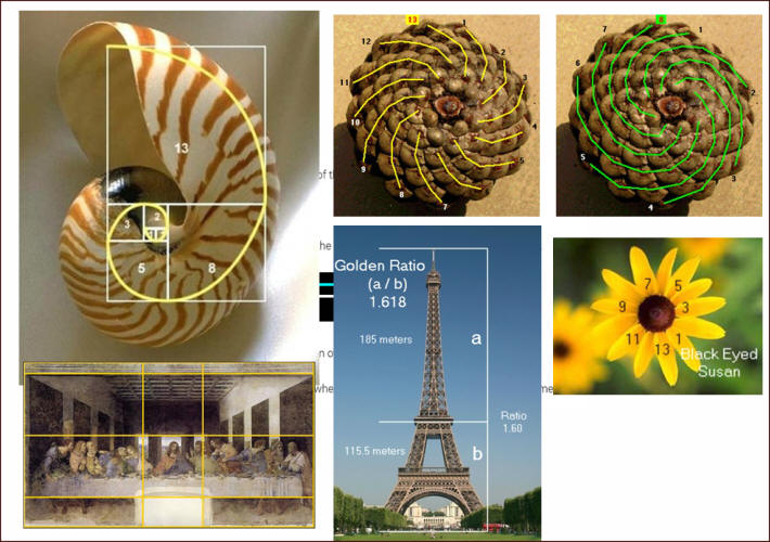
Slide 4
Let’s
look at a few examples in nature, one in art and another in architecture
(the dimensions of the Eiffel Tower).
Nature’s
spiral adds
Fib number sized squares as shown overlain on the shell where their
diagonals have been connected: 1, 1, 2, 3, 5, 8, 13 – the Fibonacci
sequence.
Pine cones viewed from the bottom show two sets of spirals: 13 in one
direction, 8 in the other – both Fib numbers.
The number of petals for many flowers is again a Fib number: here, the Black
Eyed Susan has 13 petals – again a Fib number
These are just a few examples. Fib numbers are used throughout nature
because they represent an efficient way to pack structures.
The relative dimensions shown for the Eiffel tower with its Golden Ratio
overlay shows the intermediate level as a focal point of the structure by
design. The whole structure becomes more aesthetically pleasing as a result
of these proportions.
Similarly, by design, there are many rectangles with their respective Golden
Ratios used in da Vinci’s The Last Supper to control different focal
points. Note too, it depicts Jesus and his 12 Disciples (13 again a Fib
number).
Such Fib numbers and ratios are found in lots of places. They guide us to
focal points in paintings, are aesthetically pleasing in architecture and
these same paintings, and they are optimal packing arrangements in nature.
Now let’s see how they influence pullbacks in our stock charts.
Slide 5
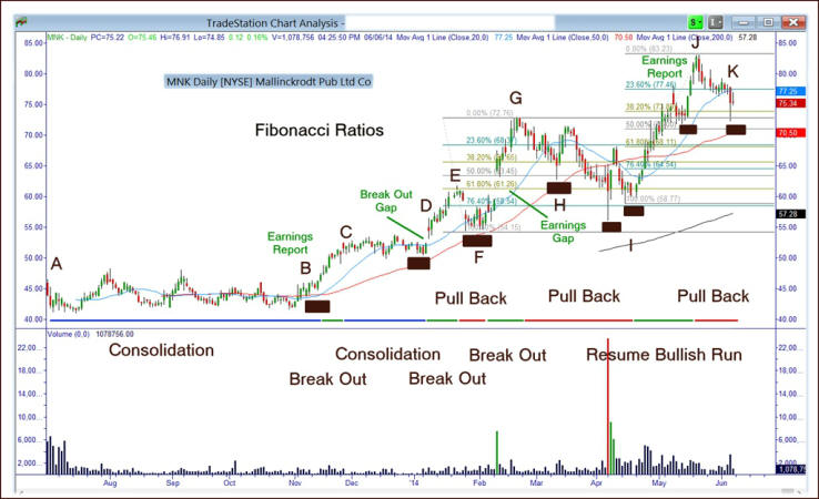
Now
Let’s look
at
the
chart of MNK.
First, its general shape:
- From point A to B, MNK was in a period of consolidation and was range
bound for several months;
- Then an earnings report drove price higher to C, where it spent another
month and a half in consolidation, as price moved along its 20-day moving
average and approached its
50-day average;
- Note, the black rectangles, which mark natural areas for stops,
identify areas that should not be violated if the stock remained bullish;
- Finally, at D, price broke higher in what’s commonly known as a
break-out gap to point E which marks the point where price began to
pullback;
- Note too, the stop could be raised again, as MNK continued to make
higher highs in both its peaks and its valleys;
- Price consolidated again for about half a month when it broke away in
another earnings related gap, moving higher to G;
- From G, price pulled back to I making a short recovery at H where
another stop could be set;
- The pullback to “I” would likely have violated the stop at H and forced
one to exit the position;
- From I, price resumed its bullish run to J where it began another
pullback to K.
Points of Interest in this chart:
- Strong TSM stocks usually alternate between bullish runs and periods of
gain consolidation or pullback; these are normal for strong stocks;
- The higher highs and higher valleys enable you to control risk with a
stop loss strategy so long as the stock continues its bullish run; when the
stock turns over, these stops are
violated and the position exited;
I prefer to enter a position at the valley of a pullback as opposed to a
breakout from consolidation because the risk control is better; with regard
to pullback expectations, let’s talk about gaps and Fibonacci levels;
Gaps as shown at point D and F are natural areas of support; frequently
price will fall back and test the gap (both at its top and at its bottom); F
is an example of price falling back to the top of the gap, as is H, while I
is an example of falling back to the bottom of the earlier earning’s gap;
Two sets of Fib ratios are shown”
Connecting the low of point F with the high at point G defines a distance;
Fib percentages likely areas of support;
- In the pullback from G, the 38.2% Fib level offers support, then at
H price temporarily bounces higher before falling to the support of its 50%
and then to its 61.8% Fib levels
of support;
- Similarly, defining the climb between the low at Point I and the
high at point J, again the 38.2% Fib level has offered support and continues
to do so as I write this.
In summary, then, good stocks pullback. They find spring board-like
recoverys at the support of Gaps, prior highs and lows and at the common Fig
levels.
Slide 6
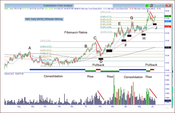
SWC
offers another look at the price
road traveled by a strong TSM stock: Consolidation, Rise and Pullback;
Note the steadily rising stop values as SWC makes a series of higher
valleys;
I particularly like the support given by the 200 day moving average in
January and later by the 20- and 50 day moving average;
The first set of Fib numbers defined by the minimum in the cup formed
between A and B and the max at C shows how the pullback from C is again
supported by these special Fib levels:
- first, the wide-range bar falls to the support of the 38.2% Fib level,
then on to the support of its 50% and on to the 61.8% where it reverses
higher;
- more recently, the climb between H and I has defined a set of Fib
levels that again were supportive at the 38.2% and 50% level before
reversing higher.
Finally, notice two other aspects of the chart: as the A to D cup & handle
played out, most of the higher volume peaks in green are found on up days;
too, the pullbacks shown were accompanied by falling volume, often another
sign of strong stock pullbacks.
Well there you have it, the Triplescreenmethod’s technical approach to
buying quality stocks. Until next time, this has been Ric Miller, creator
of the TripleScreenMethod. Thanks for listening.
|
|